Covering Lolita
“Lo-li-ta.” One of the most incredible, beguiling, mesmerising books in the history of English literature. Also one of the most controversial- which perhaps adds to its inherent allure. On the one hand, it’s a beautiful, deeply painful love story. Then you remember the creepy underbelly, and it hits you all over again. Descriptions of such pure, unbridled love jar against reminders of childlike movements, breasts that aren’t fully formed. You stop feeling so sorry for bumbling old Humbert and his excruciating passion, you remember that obnoxious little Lo can’t help being such a brat, because she’s only 12 years old.
Vladimir Nabokov does things with words that will change your life. His delicate mastery of language and the way he layers and garnishes the complexities of his subject matter is just completely wonderful- and if you haven’t read it yet, you absolutely must, immediately.
But enough gushing, though I could gush about Nabokov forever. This is about the covers: how publishers have struggled to package the book in different countries throughout the years. How do you market a love story between a man and a child? How do you visually capture that complex web of desire and repulsion that Nabokov so expertly weaves with his words?
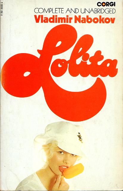
Covering Lolita, an online exhibit by Dieter E Zimmer, brings together over 150 different versions from 33 countries over 54 years. And it’s pretty cool seeing the different ways people have approached the design in different parts of the world over the years.
Several play on the ‘classic’ cultural symbol of Lolita, a teenager simpering about in heart-shaped sunglasses, sucking seductively on a lollipop, and looking suspiciously more like a nineteen year old dressing up as a little girl, than an actual child.
Taking it one step further, many of them show Lolita as a much more adult woman, to the extent that you would have no idea of the subject matter if you didn’t recognise the title (watch Nabokov chortle over the 1959 Turkish edition- “Would you look at the man and the girl… I’m not sure who is older!”)
And there are the many that eschew a picture altogether- most likely trying to avoid controversy, but quite possibly adding to the sense of notoriety in doing so.
Personally, I love this poster from Rome in 1969. It’s not quite as over-the-top and pervy as the typical image that springs to mind, but it still captures that peculiar and unsettling duality of Lolita as a child, but to some extent a knowing and seductive child. Because that’s the complexity of her character- she is flirtatious, and steps into adult roles willingly at times, without being old enough to really understand the power she holds and the implications of her actions. When it comes down to it, she’s just playing, without really understanding how serious the game is.
Which one do YOU like?


